Customer Acquisition
Web design & Development Sustainable Web Design SEO SEM | PPC B2B Marketing Digital Marketing CampaignCustomer Engagement Retention
Data Driven Marketing E-commerce Social Media Marketing Video marketing and motion Graphics

Director, CPO & Director of Advancement, EOS
We were tasked to redesign the site to be in line with their sustainable ethos.
One of the biggest web sustainability gains comes from switching to green hosting. This however was not a viable option at the time.
We therefore had to focus on other areas such as UX and visual design to bring sustainable website design principles to bear.
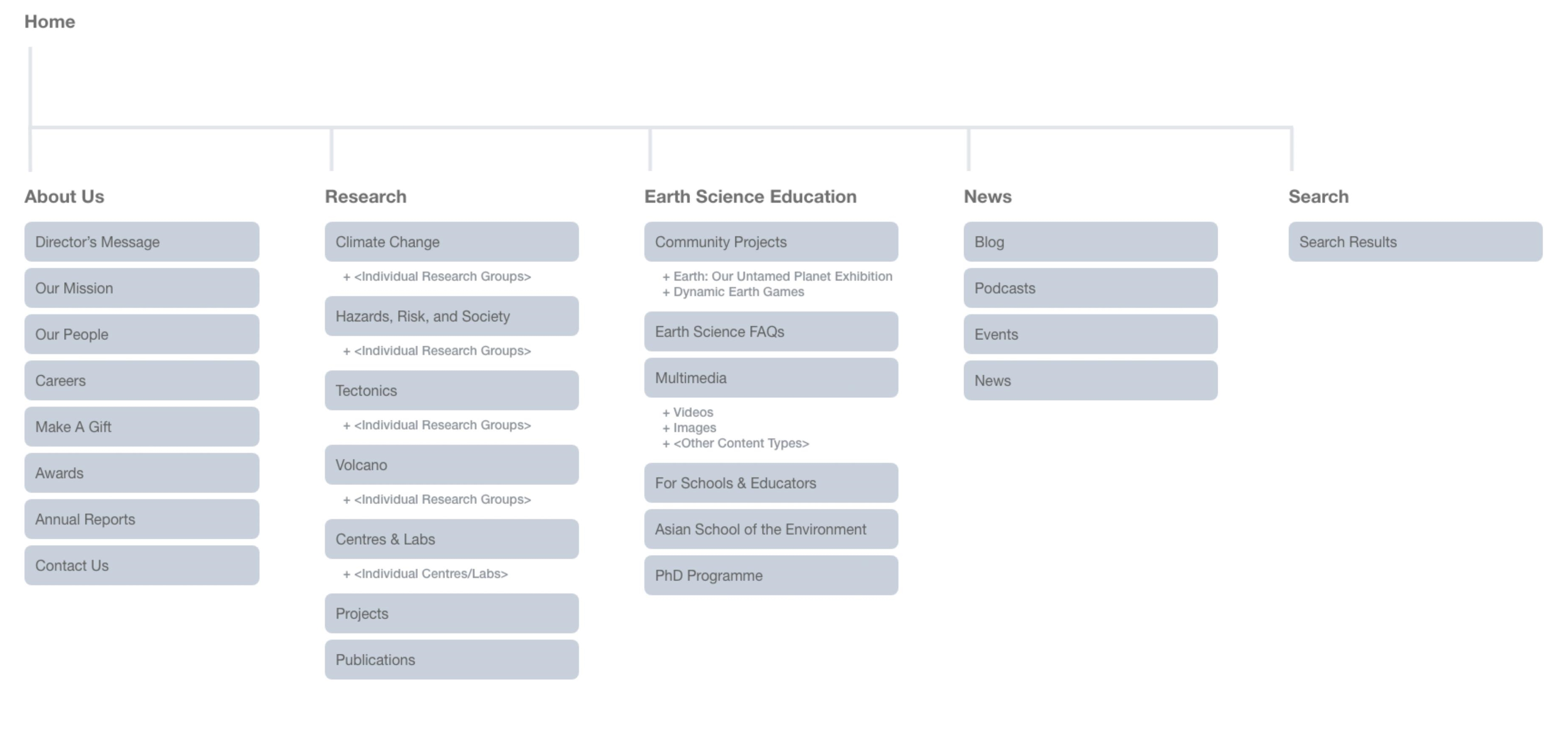
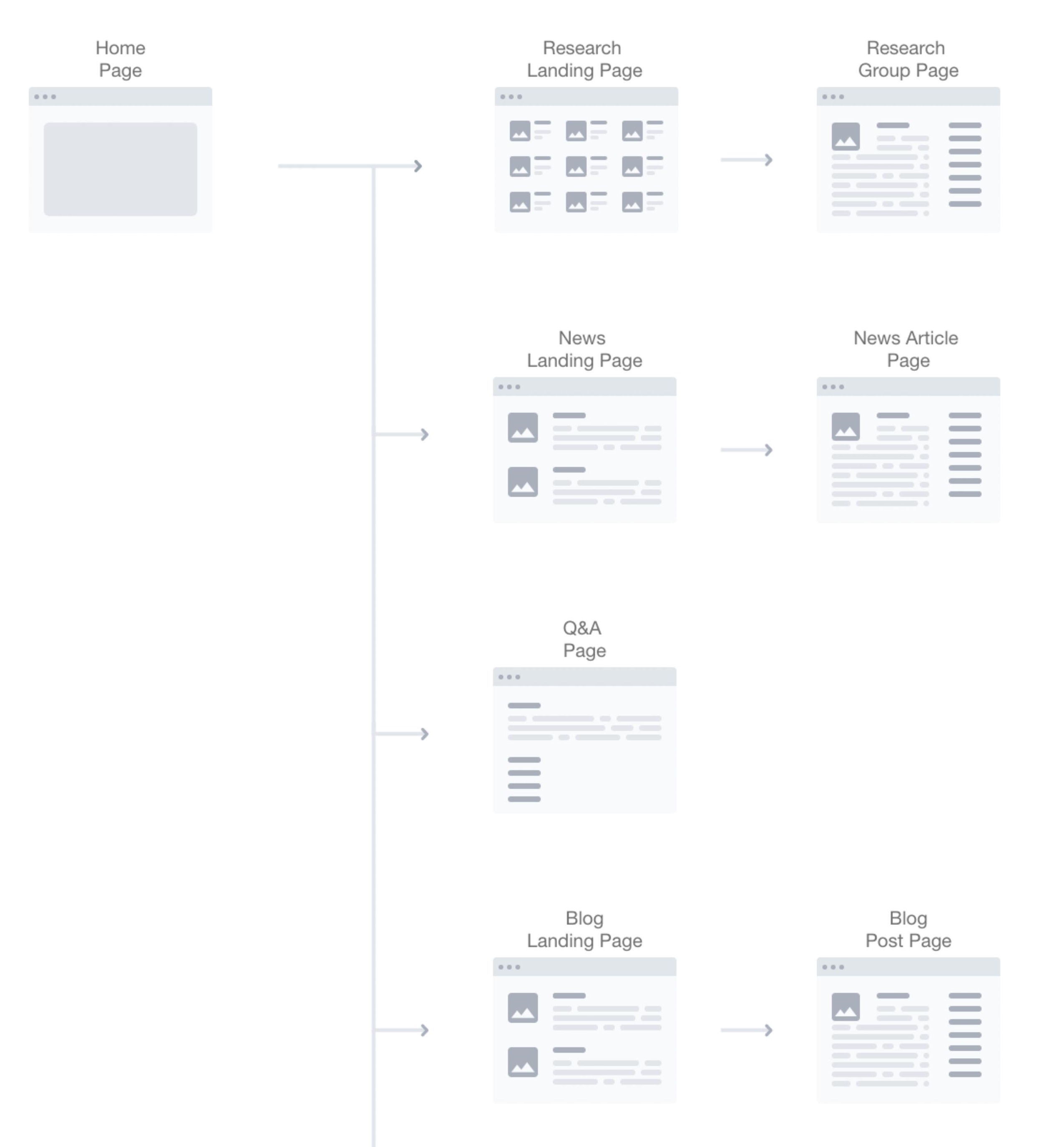
Our work started with gathering feedback from the customer-facing teams. Together with user data from site analytics, we created user journeys for customers to get faster, easier access to the most frequently browsed content on the site.
From analysing the pages with high bounce rates, we were able to streamline over 10,000 pages of content from the research pages.
This reduced the number of templates and increased re-usable components throughout the site, making it more efficient and cost-effective.
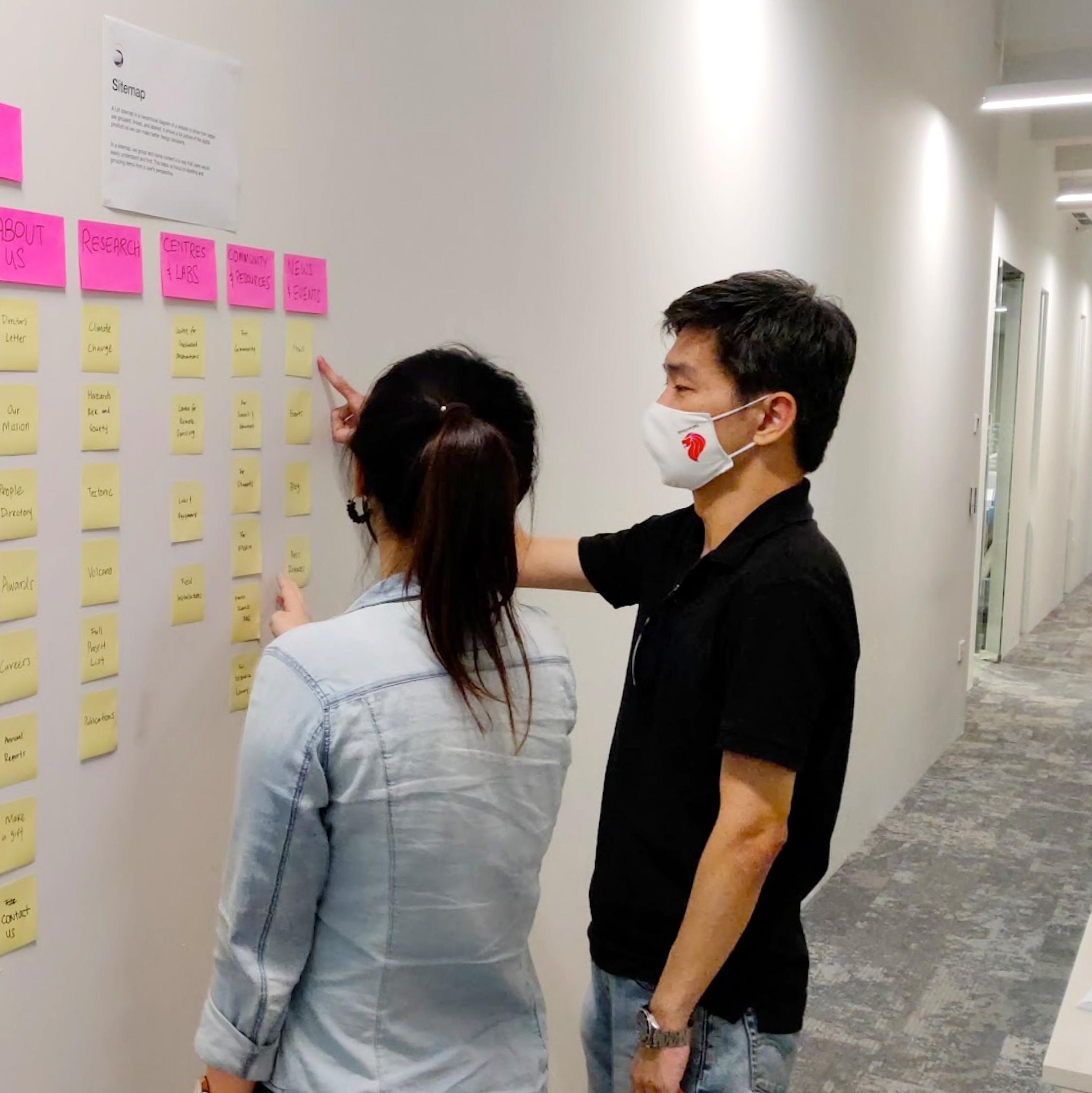
We kept workflows lean & agile by meeting early and often with stakeholders to design solutions In client reviews, project management controlled feature sets by asking questions like “Is this a nice-to-have?” and “Can we do without it?” to really go with what the users needed.
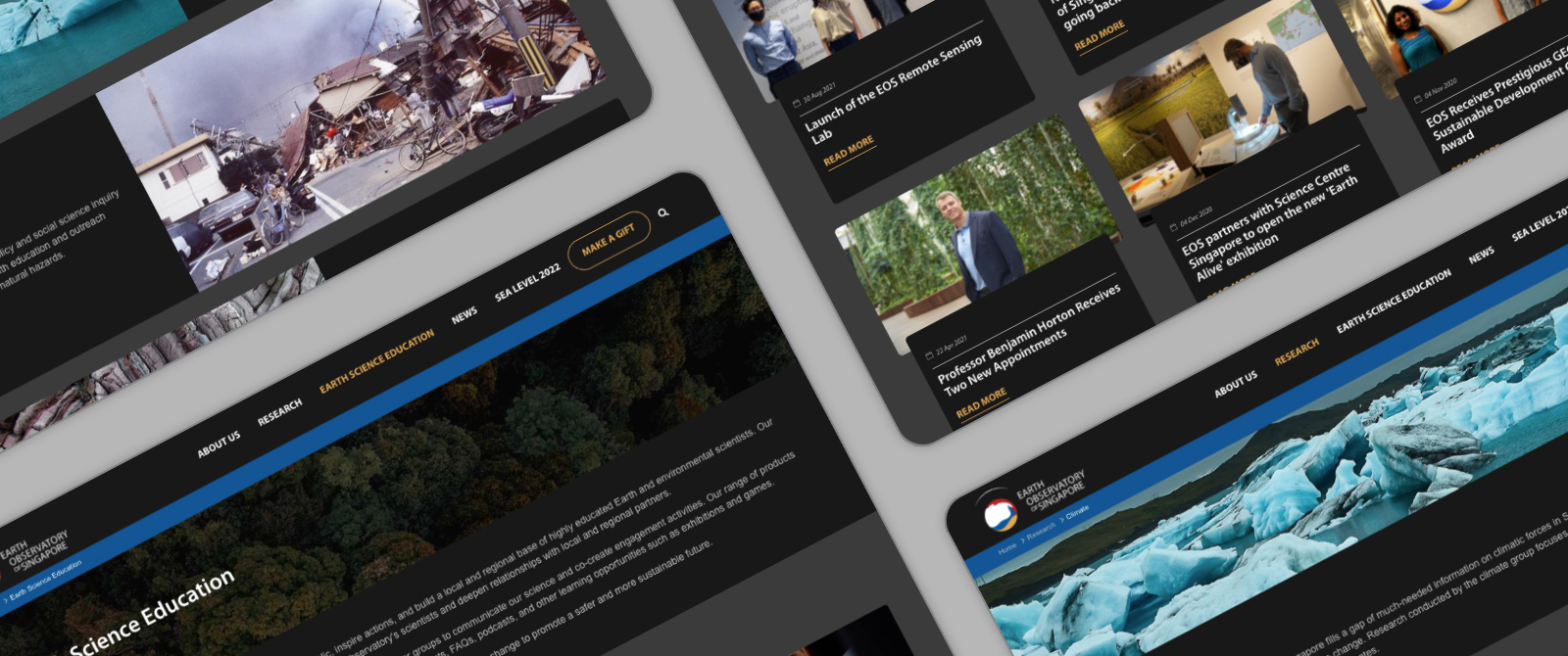
If dark mode was proven by Google to reduce electrical consumption and increasing battery life, why not stay dark by default?
The visual design avoided pure white and used light colours on text for clarity and legibility. Black was used where possible for high energy savings on OLED displays
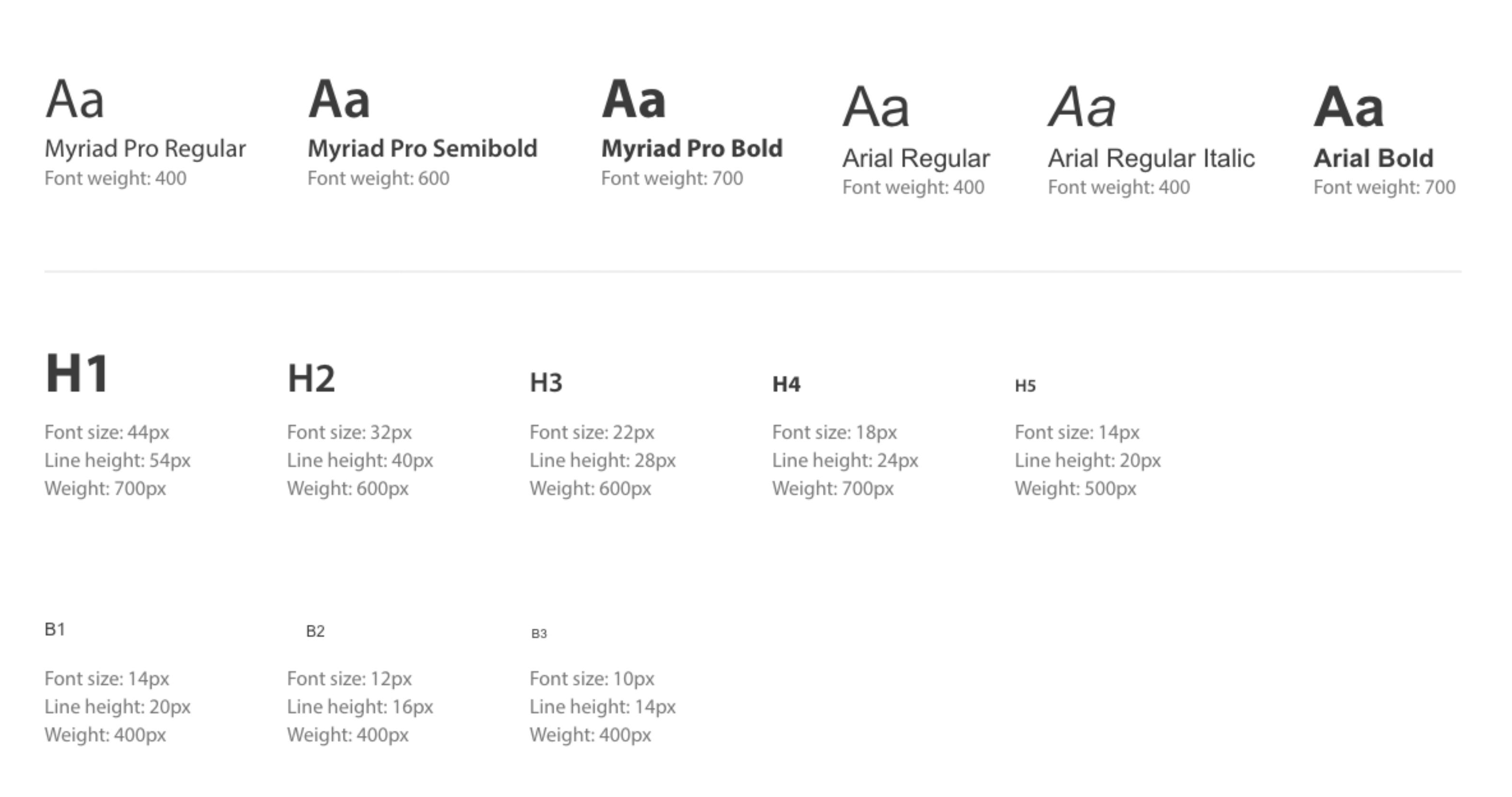
On one hand, using web fonts for everything would have enabled enhanced aesthetics but with a download penalty. On the other hand, using only system fonts would have limited us from using brand typography effectively.
We came to a compromise of using only one web font for headlines and system defaults everywhere else.